My Portfolio
In Between Shades
Awarded Honourable Mention at #CreateCOP28, presented by Art Partner and Earth Partner Presented at Waves of Change Festival, ArtScience Museum, Singapore (Aug 2023)
Personal
Individual Project
Project Overview
In Between Shades is an interactive sculpture that allows audiences to connect with the tangible visual effects of climate change on our oceans, specifically coral bleaching. The ocean has suffered significant impacts as a result of climate change, with the loss of coral reefs being one of the most obvious signs of its decline. The coral bleaching phenomenon is particularly intriguing because it reflects the current moment of the climate crisis - vulnerable, but not irreversible.
Rather than representing coral bleaching as a fixed outcome, the work focuses on its transitional state. The installation frames climate change not as a distant catastrophe, but as a process unfolding in real time with participants not positioned as observers of environmental damage, but as active agents within the system.
Personal Context and Research
As a diver, I’ve always been drawn to Southeast Asian waters, yet my greatest curiosity was reserved for my own home country, Singapore. While local diving is often dismissed for its murky conditions and poor visibility, those exact challenges are what intrigued me.
During my final-year project(FYP) research, I began learning more about coral ecosystems and discovered that Singapore’s reefs, despite covering only a fraction of the area of the Great Barrier Reef, host nearly half as many coral species due to the country’s position within the Coral Triangle. Even more striking was how these reefs have adapted to survive under constant sedimentation and urban development, thriving in close proximity to oil refineries such as Pulau Bukom.
Through this research, coral bleaching repeatedly surfaced. I encountered creative restoration efforts, from rebuilding reef structures with LEGO pieces to playing underwater soundscapes to attract fish back to damaged reefs. Although corals ended up not being the focus of my FYP, the tension they embody, between fragility and endurance, stayed with me. Over time, this research resurfaced through sketches, material tests, and interactive experiments.

Top Left: Photo of coral reefs in the waters off Shell’s biggest refinery at Pulau Bukom, from Singapore Reef Watch on Facebook
Top Right: Coral Triangle
Bottom Left: Playing sounds of healthy reef to lure back fishes, Photo by Harry Harding
Bottom Middle: Coral attached to Lego pieces are suspended on fishing lines, Photo by Wallace Woon
Bottom Right: Screen capture from a Zoom Interview I did with a PHD student focusing on coral science

Sketches I did
Research and Process (Developed Concurrently)
The project developed through parallel streams of research into corals and physical testing. Sketchbook studies and digital renders explored coral morphology and branching structures, translating biological forms into simplified geometries. These sketches guided the design of modular coral forms that could accommodate internal electronics while maintaining an organic appearance.
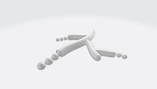


Abstract renderings of the Staghorn coral, Elkhorn coral, Pillar coral
Because the project required a material that was both light-permeable and easy to model for rapid iterations, traditional mediums like clay were unsuitable. This led to experiments with transparent 3D-printed filaments and bead structures. The latter provided the desired transparency and organic form without the time constraints of printing solid spherical geometries.


Left: Testing color penetration relative to the thickness of each print
Middle: Exploring methods to combine the tubular coral structures, eventually settling on a pre-fabricated circular acrylic plane
Right: Hand-beading process and attaching


I designed a 3D coral body that accommodates the motor, gear, and pinion.
This structure allows the top part of the coral to slide into the center while providing the stability necessary to keep the motors securely in place.

The first few print test lacked structural reinforcement, causing the motor mounts to break under the component's weight.


Improved rendition to extend the supports
to provide more weight and stability
Early prototypes also tested the movement of individual coral elements, focusing on vertical growth and retraction.
Testing the linear actuation on the different coral forms, and whether the concept works physically
Interaction Logic & Visual Language
The interaction system was designed as a direct metaphor for coral bleaching and recovery. In this installation, the participant’s hand represents human presence within the ecosystem, while the colour spot represents the algae that gives corals their colour. Coral bleaching occurs when environmental stress causes coral polyps to expel this symbiotic algae living in their tissues. If conditions stabilise, the coral can recover by repopulating its algae.
When participants hover their hands above the Leap Motion sensor, the colour spot appears on the screen and follows the movement of their hand and moves fluidly.
The translucent 3D-printed coral sculptures sit directly above the screen. When a color spot aligns beneath a sculpture, it casts light upward to visually "restore" the coral and trigger its growth. As the color moves away, the coral slowly retracts, symbolising the process of bleaching.
By tying these elements together, the work frames recovery not as a one-time action, but as an ongoing relationship between human behavior and ecological response.
I conducted a proof-of-concept experiment to tie the visual and technical components together, building the initial prototype around a plastic water bottle.
Early visual tests of the liquid color spots revealed issues with the animation.
The colors did not fade fast enough and exhibited a jittery "vibration" rather than a smooth, flowing motion.
Building the System
The electronics and interaction logic were developed in tandem with physical prototyping. I used a Leap Motion sensor to track hand movements, translating spatial data into a "color spot" mapped to the X and Y axes within TouchDesigner. Below each coral sculpture, I mapped invisible triggers, squares set to 0% opacity.


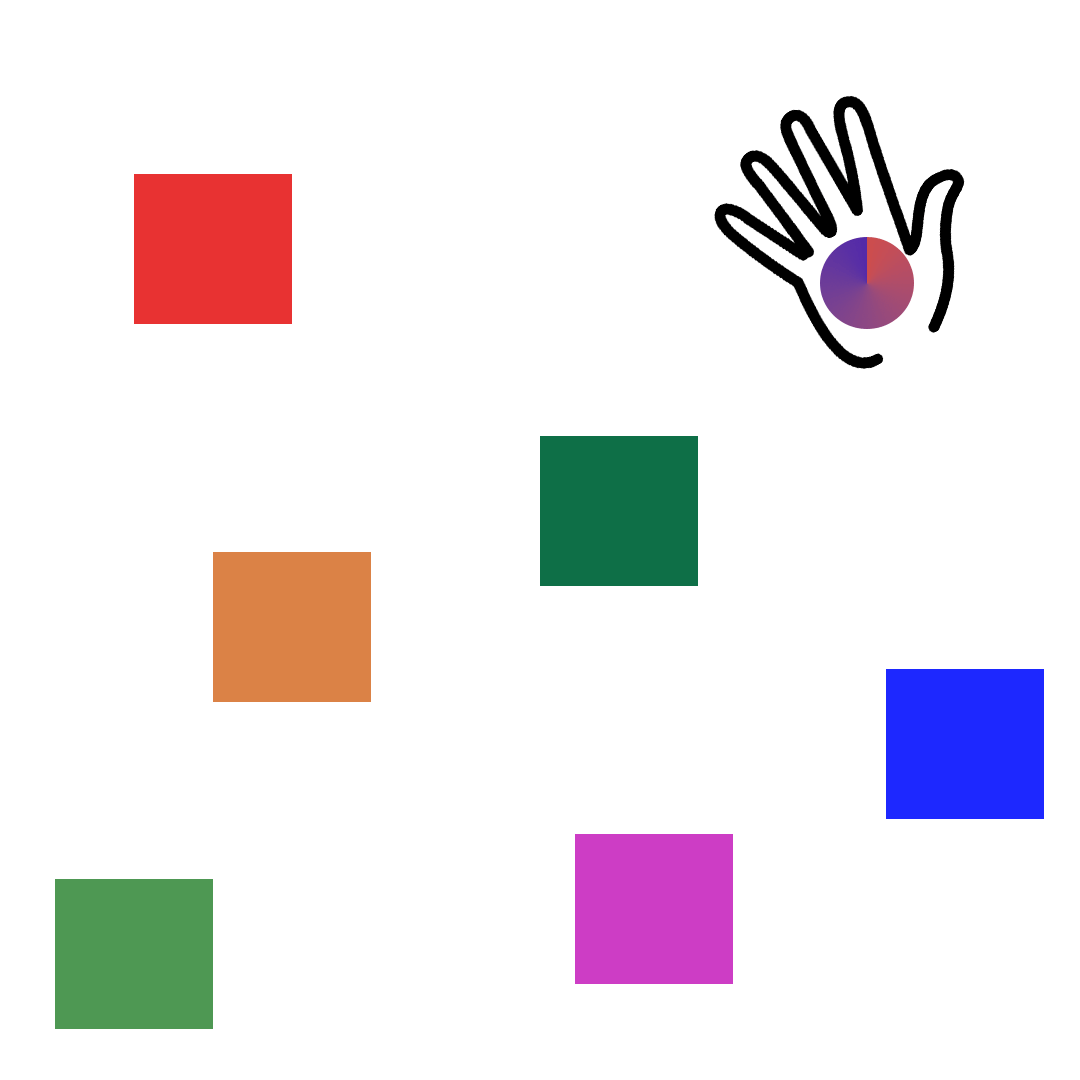

When the color spot and the trigger squares overlapped, TouchDesigner sent a character-based message to the Arduino via OSC (Open Sound Control). For example, if the spot intersected with square 'B', TouchDesigner transmitted the corresponding character to the Arduino, which then activated the motor for the coral positioned directly above it.

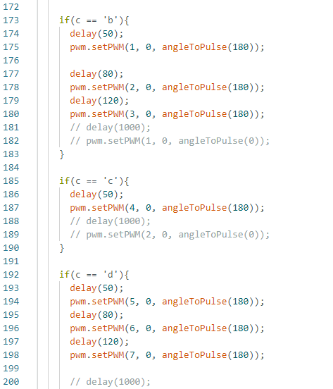
Code from Arduino:
To receive the alphabet message and trigger the correct motor accordingly
Code from TouchDesigner:
To send the corresponding alphabet message upon overlap
To manage the array of motors, which exceeded the Arduino's native pin capacity, I integrated a PCA9685 PWM Driver. This allowed for independent control of each motor, ensuring every coral element could react individually to the user's interaction.

PCA9685 PWM Driver,
My first time working with one
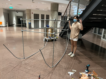
Final coral arrangement, fully integrated and wired
All cables are managed using heat-shrink tubing.

Installation and Spatial Considerations
The installation was designed as a contained and intimate encounter. I decided to keep the sensor and art piece separate because logically it didnt make sense to trying to integrate the whole piece onto one pedestal. During user testing, I observed that participants instinctively moved their hands up and down, mimicking the physical motion of the corals rather than guiding the color across the screen.
To address this, a laser-cut instructional element was added around the sensor. Rather than explaining the system in detail, it subtly redirected movement toward horizontal hovering.
.jpg)
Lighting conditions were controlled so that the primary illumination came from the screen, allowing colour and motion to define the space.


Digital mockups of the installation
PC ended up being placed on the other end away for the audience

Final placement of the piece
Reflection
The development of In Between Shades was physically and mentally exhausting in ways I didn’t fully anticipate. Much of the process involved repeated decision-making around constraints that felt both practical and conceptual. The fabrication process was especially demanding. The 3D printer failed repeatedly, leading to wasted time and material. I constantly questioned whether the coral forms were recognisable enough or too abstract and whether using plastic as a material would be misread as contradictory rather than critical. At some point, I also started questioning if a linear vertical movement was sufficient to represent growth, or if I should have pursued a complex, kinetic unfolding similar to the works of Studio Drift.
Through these struggles, I learned to trust process over polish. Not every element had to be perfect. In fact, one motor failed midway through the exhibition. At that moment, there was nothing to do but repair and move on. Ultimately, I am grateful to have realised this vision for such a significant opportunity.
Sonder
Personal
Individual Project
Project Overview
Sonder takes its name from The Dictionary of Obscure Sorrows, describing the realisation that every passerby lives a life as vivid and complex as one’s own. The project explores how immersive technologies can create a safe, contemplative space for storytelling and listening. Inspired by the Night Car Therapy scenes in Snowpiercer (TV Series) and immersive sound-and-light works such as Laurie Anderson’s Chalk Room, Sonder aims to slow participants down and reframe conversation as an intentional act.
Conceptual Foundations
During this period of exploring interactive spaces designed for slowing down and intentional presence, I was deeply influenced by the television series Snowpiercer, particularly Miss Audrey’s Night Car. Within the narrative, the Night Car was initially intended to function as a brothel, but Miss Audrey recognised the need for something else entirely. Through her intervention, part of the Night Car was transformed into the Isolation Chamber. A room designed around brief sessions of isolation and sensory deprivation, where passengers could process grief and loss following the collapse of the world they once knew.

Screen Capture from https://screenrant.com/snowpiercer-audrey-night-car-therapy-isolation-chamber/
This logic of intentional reduction became central to Sonder. This project withholds visual context around who each story belongs to in order to create space for reflection and connection.
This approach was further reinforced through my experience of Laurie Anderson and Hsin Chien Huang’s The Chalkroom, a VR installation that invites viewers to drift through fragments of memory and language. Like the Isolation Chamber, Chalkroom relies on quiet immersion rather than spectacle, demonstrating how reduced sensory input can heighten emotional resonance.

Screen Capture from https://laurieanderson.com/?portfolio=chalkroom
Experiencing The Chalkroom by Laurie Anderson and Hsin Chien Huang at The Singapore Biennale 2019
Immersive Space & Unreal Experiments
Early tests focused on learning Unreal’s spatial and lighting capabilities, using free Marketplace assets to rapidly prototype environments rather than bespoke modelling.
I experimented with Unreal’s water plugin and floating actors, initially imagining a buoyant, weightless environment. However, the resulting motion felt too aquatic. Conceptually, I was aiming for a helium-like suspension rather than water-based physics. This mismatch revealed an early tension between technical affordances and artistic intent.
Environment building play test
Introducing various lighting elements
To cultivate a meditative mood aligned with the project’s ‘zen’ aspiration, I introduced murky blue tones, light shafts, and firefly particles, trying to focus on the interplay of light.
Projection Challenges
The project initially took the form of an immersive room using Unreal Engine supported by three virtual cameras.

Immersive room sketch, which would stretch over 3 walls
Attempting to scale the Unreal environment across three projectors introduced significant technical constraints. Tools like Spout and Syphon were incompatible with my specific engine version, which I was required to use for other version-specific plugins, while professional alternatives like LightAct remained inaccessible. Although Unreal’s nDisplay system worked in principle, configuration issues prevented a successful projection-room deployment. This moment marked the first major pivot. Rather than forcing a projection-based solution, I began considering other forms of immersion.
Interaction Logic with Voice

Initial sketch, imagining how voice could contribute to the environment
A key interaction idea initially was that spoken voice would directly influence the virtual environment. Using TouchDesigner connected to Unreal via OSC, I experimented with how voice could spawn or manipulate geometry in Unreal.
Unreal and TouchDesigner connectivity test
Unreal and TouchDesigner connectivity test within environment
This approach surfaced issues of latency and instability. Delayed responses also disrupted the sense of intimacy I was aiming for.
To avoid rigid scaling animations, I developed materials that responded dynamically through world displacement driven by noise. This allowed geometry to feel more ‘alive’ as it reacted to sound. However, the technical instability again raised questions about control, leading me to consider more intentional input methods.
Geometry manipulation experiements
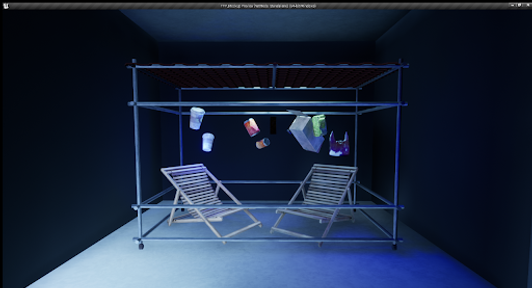
Installation and Staging
To ground the virtual experience physically, I designed a raised platform using industrial crates fitted with fluorescent bulbs. The lighting system used a parallel circuit with four bulbs, intentionally diffused by leaving white fabric intact to soften light leakage. This platform became a liminal threshold between the physical and virtual, reinforcing the act of stepping into a space of attention and listening.


Evolution of the platform
Pivotal Changes
At this stage, the project shifted from audio-reactive visuals to a sort of story container. Spoken recordings were attached to floating spheres, with each sphere holding a single narrative rather than contributing to a shared soundscape.
This shift required a restructuring of the system logic. Spheres and audio files were spawned into parallel arrays and assigned shared identifiers to ensure that each story remained correctly paired with its corresponding object. Audio was imported during runtime using a dedicated plugin, and additional safeguards were introduced to prevent existing recordings from being overwritten.
Spawning story containers while synchronously generating audio files
Initially, recording was triggered automatically through voice detection. However, this approach quickly proved ineffective, as natural pauses in speech caused recordings to fragment into multiple unintended clips. To address this, the interaction was redesigned to require participants to intentionally press a key to begin recording.
Spawning using voice
Spawning while pressing and holding a button
To ensure stories were encountered individually, audio only played when a participant approached a sphere. Visual feedback of this interaction was provided via Unreal’s Niagara particle system, which triggered upon contact. This reinforced the sense of an intimate, embodied exchange rather than a passive listening experience.
Participant interaction with a sphere
From Virtual Camera to VR
After initial tests with a virtual camera and a mobile-based approach, ultimately VR emerged as the most coherent solution, preserving immersion while integrating spatial navigation and audio listening.
The transition to VR introduced complex technical hurdles, specifically in developing an asymmetrical multiplayer design. One participant acts as the VR listener, one as a PC-based recorder, as well as the implementation of one non-traditional third-person VR perspective. Despite these challenges, I felt the depth of the final experience justified the technical steepness.
Participants' POV
Central Screen's POV
Reflection
Sonder did not emerge from a fixed technical plan, but from a consistent emotional intention. From the outset, I was less concerned with locking down a final system than with allowing room for experimentation, particularly as this was my first time working with Unreal Engine.
Although the system could theoretically exist as a single application, I deliberately separated it into distinct stations that asked participants to take different actions. The separation of stations becomes less a technical necessity and more a conceptual one. Distributing actions across multiple stations prevents participants from performing every gesture in one place and immediately ending the experience, reinforcing the idea that listening, speaking, and observing require time and attention. If I had more time, I would have explored additional variations of the virtual environment, with how and where the sphere move. But overall, I feel the project achieved what it set out to do.
The Ocean We So Love
Academic
Individual Project
Project Overview
The Ocean We So Love began as an investigation into how interactive systems could translate the scale and persistence of marine plastic pollution into a bodily experience. While plastic pollution is widely discussed, it is most often encountered through statistics or media imagery that remain abstract and emotionally detached. Rather than merely depicting the crisis, I wanted to design a system that behaves like the problem itself- relentlessly cyclical, fueled by human presence.
Material Research: Marine Debris
Material research played a foundational role in shaping the project. Marine debris was collected through beach clean-ups and Kayak “N” Klean sessions in Singapore’s coastal and mangrove areas. I made a deliberate decision to minimally treat the materials, cleaning them only enough to dry while preserving barnacles and the grime. Barnacles, in particular, acted as unintended markers of time, indicating how long an object had remained submerged. I wanted my audience to understand that plastic goes beyond being just something visually polluting but instead something structurally embedded within marine ecosystems.

Sorting out the trash collected from a Kayak N Klean session

Drying in the state they were found
The collection process also revealed the transboundary nature of marine debris. Foreign-priced bottles and chewing gum packaging, which is illegal in Singapore, highlighted how plastic pollution cannot be easily attributed to individual behaviour or national responsibility.


Chewing Gum packaging found during beach cleanup

Cocacola bottle found with stated price of 2.80 Ringgit (Malaysian Currency)
Form Experiments
Initial formal experiments explored mechanised wave-like movement using motors and wheels. These prototypes took the form of a rectangular cage that rolled back and forth under motor control. While the system successfully produced rhythmic motion, it quickly revealed structural limitations.

Initial render of structure prototype with sitting under
Initial prototype with space under to accommodate an audience
The mechanical components struggled under the weight of the structure and debris. More importantly, automation positioned participants as passive observers rather than contributors. But I wanted a piece that required physical participation.

Device attached to motor, using gear and gear rack to probe structure movement
Structural Shift: The Cradle Form
The project evolved into a human-powered structure inspired by the form of a boat. The form also introduced layered associations with vessels, and cargo. This design allowed the structure to rock forward and backward through participants' interaction.


While brainstorming on the theme of rocking and movement of waves, this cradle inspired form came along.
I originally wanted to fabricate a curved plane,
but it was too expensive.
Developing the structure involved extensive material iteration. I needed help curving the wire without kinking the conduit pipes and first few attempts to join these curved pipes using 3D-printed connectors failed under load, breaking during stress tests. These breakdowns provided immediate feedback about weight distribution and material limits.


Render of connector
Failed attempt to use the printed connector
In response, I replaced single-point connectors with multiple metal supports that distributed the structural load more effectively.


DIY connector using metal steel bands and hose clamp
Digital Visuals
Hoping to bring attention to the state of marine trash and to lead people to taking a closer look at the trash around us, I incorporated photos I took on my beach scavenging trips into my set-up. This documentation was meant to alert those who are not exposed, the state of the trash when found.
The first rendition tried to corporate 3D water with 2D images. The water would flow to either end of the screen according to the rocking of the structure, via the readings of an accelerometer. The water would flow to reveal stacking images under it, representing the accumulation of trash in our oceans.
_HEIC.png)
Accelerometer placed
on top of cradle structure
Graphics rendered and flow according to accelerometer readings,
revealing the trash archival photos beneath
https://youtu.be/-EWS9Yp-Qlk?si=hAcBnqgLGPC1K9Uq
User testing with initial graphics
Many commented that the surface looked much like oil, which had potential to be linked to pollution, but I personally felt that it was an additional layer to the main message I was trying to express. Hence, I moved away from revealing the images through this method and brainstormed for another style.
The final imagery was eventually settled to take on a cleaner and minimalistic approach, allowing the focus to be on the photographed images. Before any rocking of the cradle, it sees the images floating in 3D space and moves according to the audio track. The movement of the images are in-sync with the waves layer of the audio which imitates the movement of trash in real life waters. It is manipulated on the X, and Z axis using TouchDesigner, continuing to re-emphasise the repetitive moment in our trash in the ocean. Rocking of the cradle will cause the screen to move through the documented photographs that are randomly laid out in the 3d visualisation.
Final imagery before rocking cradle structure
Final imagery while rocking cradle structure
Spatial Design
The surrounding space was deliberately designed to avoid romanticised ocean imagery. Industrial materials, concrete textures, and controlled lighting created a cold, utilitarian environment. Shadows cast by suspended debris animate the walls as the structure moves, immersing participants within the system and making their physical presence visible.
Setting up the space

Mock-Up render of setup
Interaction instructions were kept minimal, encouraging discovery through engagement rather than explanation.

Mock-Up render of instruction placard
Reflection
With The Ocean We So Love, I wanted participants to discover waste for waste itself, to be confronted with the fact that the material world is made to be disposed of and replaced rather than recycled. Rather than aestheticising debris or transforming it into something new, I was interested in amplifying the discomfort of recognising these materials for what they are, and in extending the time participants spent with that realisation.
Throughout the process, I often questioned whether the work was carrying too many layers of association at once. The scale of the final structure also introduced its own challenges. I realised that participants were more hesitant to interact with an object that matched their own physical size. With more time and resources, I would have preferred to build two smaller structures rather than a single large one, allowing for more approachable points of entry.

Mock-Up render of 2 smaller cradles version
Mid-point experimentation to make a smaller version
Despite these uncertainties, the process itself became one of the most valuable aspects of the project. Conversations with participants during testing, as well as informal input from friends who contributed ideas along the way, shaped the work in ways I could not have anticipated alone. The project ultimately became less about resolving a problem and more about staying with it.
Birds of Paradise E-commerce Visual Materials
Professional
Team Project, Role: Creative Director, Prototyper
Project Overview
During my internship at Birds of Paradise, the onset of COVID-19 forced a rapid shift from in-store purchases to online e-commerce. The brand had to pivot quickly and the challenge became how to sell gelato through a purely visual online format. Within a short timeframe, I was tasked with brainstorming and developing imagery that could communicate flavour and texture through imagery alone for the e-commerce page.
Conceptual Foundations
In a physical gelato shop, customers rely on tasting before making a choice. Online, that step disappears. While flavour descriptions could help bridge this gap, I was interested in exploring whether form itself could carry those qualities.
The core idea was to sculpt the gelato in ways that visually embodied the characteristics of each flavour. Rather than presenting uniform scoops, each gelato would be shaped to reflect its taste profile.
Sculpting Process
Each flavour was approached as its own conceptual brief. Concepts were developed in advance, and I had one day to sculpt the gelato and conduct a test shoot, photographing variations before shortlisting the strongest composition to be recreated during the final photoshoot. The following are some examples of the flavours:
Dark Chocolate Sorbet is rich and intense. To express this, the gelato was sculpted into three stacked, block-like layers. I enjoyed how the rigid geometry and weighty form visually suggested a bold, uncompromising flavour.

Final shortlisted form after experiment
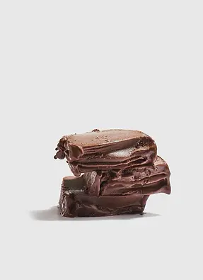
Photo courtesy of https://birdsofparadise.sg/
Sea-salt Hojicha carries an underlying bitterness softened by salt. I explored uneven, slightly wavy contours while maintaining a solid, stone-like mass. The result sits somewhere between organic and grounded, reflecting both the depth of roasted tea and the sharpness of salt.

Final shortlisted form after experiment

Photo courtesy of https://birdsofparadise.sg/
Peach & Rose Sorbet is light and floral. To express that, I introduced curves, frilled textures, and flowing edges. The gelato was sculpted to echo the shape of a blooming rose, moving away from blocky forms and toward something softer and more fluid, reinforcing the flavour’s aromatic qualities.

Final shortlisted form after experiment
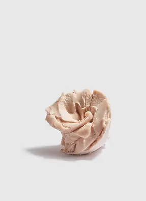
Photo courtesy of https://birdsofparadise.sg/
Mango Sorbet is smooth and full-bodied. Rather than exaggerating sweetness, I focused on its rounded, fleshy quality. The final form took on a gently domed, hump-like silhouette with soft folds across the surface. The simplicity of the form allows the flavour to feel familiar and comforting rather than exaggerated, and overly artifical.
.jpg)
Final shortlisted form after experiment

Photo courtesy of https://birdsofparadise.sg/
For a flavour like Pistachio, it is already a flavour that many customers were already familiar with, so the challenge was not recognition but differentiation. Instead of abstracting too far, the gelato was shaped using three pistachio-like forms stacked into a triangular composition, leaning against one another. This arrangement introduces visual interest while maintaining immediate familiarity.

Final shortlisted form after experiment

Photo courtesy of https://birdsofparadise.sg/
Reflection
Despite the tight time constraints, this project was genuinely so fun. It reminded me how much information can be communicated through shape alone and it is also not everyday you get to work with unconventional materials, especially not gelato! So I am very thankful for the trust my bosses had in me even though I was just an intern then. While the context was commercial, the exploration echoed a recurring interest in my practice of creating and subverting experiences instead of explicitly showing. Very proud of this work!